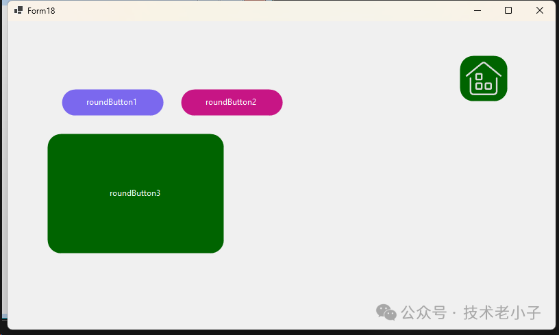
在WinForms開發中,默認的Button控件外觀比較單調,且圓角效果顯示質量較差。本文將介紹如何使用GDI+創建一個高質量的自定義圓角按鈕控件。
這個控件參考了油管一個大神的寫法,確實用的技術一樣,雙層繪制機制是重點,他寫的確實漂亮!!!
主要特性
可自定義邊框大小
可自定義圓角半徑
可自定義邊框顏色
支持背景色和文本顏色設置
平滑的圓角渲染效果
實現步驟
創建自定義按鈕類
首先創建一個繼承自Button的自定義類:
using System.Windows.Forms;
using System.Drawing;
using System.Drawing.Drawing2D;
using System.ComponentModel;

public class RoundButton : Button
{
    // 字段定義
    private int borderSize = 0;
    private int borderRadius = 20;
    private Color borderColor = Color.PaleVioletRed;
}
添加屬性
為按鈕的自定義特性添加屬性:
[Category("Round Button")]
public int BorderSize
{
    get => borderSize;
    set
    {
        borderSize = value;
        Invalidate();
    }
}

[Category("Round Button")]
public int BorderRadius
{
    get => borderRadius;
    set
    {
        borderRadius = value;
        Invalidate();
    }
}

[Category("Round Button")]
public Color BorderColor
{
    get => borderColor;
    set
    {
        borderColor = value;
        Invalidate();
    }
}

[Category("Round Button")]
public Color BackgroundColor
{
    get => BackColor;
    set => BackColor = value;
}

[Category("Round Button")]
public Color TextColor
{
    get => ForeColor;
    set => ForeColor = value;
}
構造函數實現
設置按鈕的默認外觀:
public RoundButton()
{
    FlatStyle = FlatStyle.Flat;
    FlatAppearance.BorderSize = 0;
    Size = new Size(150, 40);
    BackColor = Color.MediumSlateBlue;
    ForeColor = Color.White;
    Resize += new EventHandler(Button_Resize);
}

private void Button_Resize(object sender, EventArgs e)
{
    if (borderRadius > Height)
        borderRadius = Height;
}
圓角路徑生成
實現圓角圖形路徑的生成方法:
private GraphicsPath GetFigurePath(Rectangle rect, float radius)
{
    GraphicsPath path = new GraphicsPath();
    float curveSize = radius * 2F;

    path.StartFigure();
    // 左上角
    path.AddArc(rect.X, rect.Y, curveSize, curveSize, 180, 90);
    // 右上角
    path.AddArc(rect.Right - curveSize, rect.Y, curveSize, curveSize, 270, 90);
    // 右下角
    path.AddArc(rect.Right - curveSize, rect.Bottom - curveSize, curveSize, curveSize, 0, 90);
    // 左下角
    path.AddArc(rect.X, rect.Bottom - curveSize, curveSize, curveSize, 90, 90);
    path.CloseFigure();

    return path;
}
重寫OnPaint方法
實現按鈕的繪制:
protected override void OnPaint(PaintEventArgs pevent)
{
    base.OnPaint(pevent);
    Rectangle rectSurface = ClientRectangle;
    Rectangle rectBorder = Rectangle.Inflate(rectSurface, -borderSize, -borderSize);
    int smoothSize = 2;

    if (borderSize > 0)
        smoothSize = borderSize;

    if (borderRadius > 2) // 圓角按鈕
    {
        using (GraphicsPath pathSurface = GetFigurePath(rectSurface, borderRadius))
        using (GraphicsPath pathBorder = GetFigurePath(rectBorder, borderRadius - borderSize))
        using (Pen penSurface = new Pen(Parent.BackColor, smoothSize))
        using (Pen penBorder = new Pen(borderColor, borderSize))
        {
            pevent.Graphics.SmoothingMode = SmoothingMode.AntiAlias;
            // 按鈕表面
            Region = new Region(pathSurface);
            // 繪制表面邊框
            pevent.Graphics.DrawPath(penSurface, pathSurface);
            // 按鈕邊框
            if (borderSize >= 1)
                pevent.Graphics.DrawPath(penBorder, pathBorder);
        }
    }
    else // 普通按鈕
    {
        pevent.Graphics.SmoothingMode = SmoothingMode.None;
        // 按鈕表面
        Region = new Region(rectSurface);
        // 按鈕邊框
        if (borderSize >= 1)
        {
            using (Pen penBorder = new Pen(borderColor, borderSize))
            {
                penBorder.Alignment = PenAlignment.Inset;
                pevent.Graphics.DrawRectangle(penBorder, 0, 0, Width - 1, Height - 1);
            }
        }
    }
}
處理父容器顏色變化
為確保按鈕在父容器顏色變化時正常顯示:
protected override void OnHandleCreated(EventArgs e)
{
    base.OnHandleCreated(e);
    Parent.BackColorChanged += Container_BackColorChanged;
}

private void Container_BackColorChanged(object sender, EventArgs e)
{
    Invalidate();
}
 ?
?
雙層繪制機制
外層路徑(pathSurface):定義按鈕的整體形狀
內層路徑(pathBorder):定義邊框的位置 代碼說明一下。
protected override void OnPaint(PaintEventArgs pevent)
{
    base.OnPaint(pevent);
    // 獲取按鈕的客戶區矩形
    Rectangle rectSurface = ClientRectangle;
    // 根據邊框大小計算內層矩形
    Rectangle rectBorder = Rectangle.Inflate(rectSurface, -borderSize, -borderSize);
    int smoothSize = 2;
    if (borderSize > 0)
        smoothSize = borderSize;

    if (borderRadius > 2) // 圓角按鈕
    {
        using (GraphicsPath pathSurface = GetFigurePath(rectSurface, borderRadius))          // 外層路徑
        using (GraphicsPath pathBorder = GetFigurePath(rectBorder, borderRadius - borderSize))  // 內層路徑
        using (Pen penSurface = new Pen(Parent.BackColor, smoothSize))                      // 外層畫筆
        using (Pen penBorder = new Pen(borderColor, borderSize))                            // 邊框畫筆
        {
            pevent.Graphics.SmoothingMode = SmoothingMode.AntiAlias;
            // 1. 設置按鈕區域
            Region = new Region(pathSurface);
            // 2. 繪制外層邊緣
            pevent.Graphics.DrawPath(penSurface, pathSurface);
            // 3. 繪制內層邊框
            if (borderSize >= 1)
                pevent.Graphics.DrawPath(penBorder, pathBorder);
        }
    }
}
注意事項
圓角半徑不能大于按鈕高度
為獲得最佳顯示效果,建議使用AntiAlias模式
需要正確處理父容器顏色變化的情況
編譯項目后才能在工具箱中使用該控件
總結
通過繼承Button類并使用GDI+繪圖技術,我們實現了一個可自定義的圓角按鈕控件。該控件不僅提供了良好的視覺效果,還支持多種自定義選項,可以滿足大多數界面設計需求。
閱讀原文:原文鏈接
該文章在 2025/2/5 17:28:53 編輯過


 400 186 1886


